
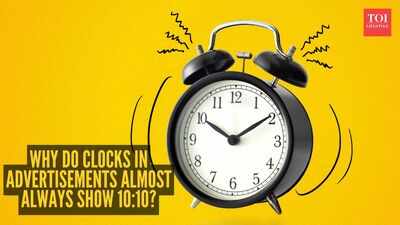
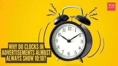
You may have wondered if it’s just you but you’ve probably noticed that watches and clocks in ads seem to be frozen at 10:10. That time is used on purpose, and it is one of the simplest but smartest tricks in product advertising. Here’s why clocks often show 10:10 in advertisements:
The visual reason
The biggest reason brands use 10:10 is symmetry. At that time, the hands form a neat open “V” shape that looks balanced and easy to read. Instead of crossing over each other or covering the face, the hands frame the dial in a pleasing way.That shape also lets people see the watch clearly.The logo, numbers and design details are less likely to be covered by the hands, making the product look better in photos and advertisements. A smile on the dial There is also a psychological effect. The 10:10 hand position is often said to look like a smile, giving the watch a more positive and friendly feeling. Even if viewers don’t consciously think about it, the image can still make the product seem more welcoming. That is part of why the time became such a standard in advertising. It is not just about showing time. It is about making the product feel good to look at.
Why not another time
Other times can work too, but they usually do not look as neat. A time like 8:20 was used in older advertising because it also created symmetry, but 10:10 became more popular later because it often looks cleaner and more uplifting. The hands at 10:10 also avoid covering the top part of the face, where brand names are often placed.There are practical reasons too.Watches often have date windows or additional dials, and 10:10 allows those to be seen rather than covered up by the hands.
A long-running tradition

Over time, 10:10 became a habit across the watch industry. Once brands saw that it made products look polished and appealing, it spread from one advertisement to another until it became the default setting. Today, most people recognize it immediately, even if they have never asked why it is there.That is why the time often appears in magazine ads, online product pages, billboards and store displays. It has become part of the visual language of watch marketing.
What it says about advertising
The choice of 10:10 shows how much thought goes into a simple product image. A tiny change in hand position can make a watch feel more elegant, more balanced and more appealing. Advertising often works this way: the best details are the ones you hardly notice at all.So the next time you see a clock or watch in an ad showing 10:10, you will know it is not random.It is a carefully chosen position designed to make the product look its best.